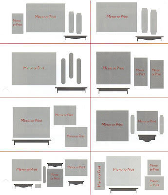
 Asymmetrical balance is more challenging than symmetrical groupings. However, they are usually more interesting to experience and typically less formal in appearance. I use alot of asymmetrical groupings in my home. I like to call my style "Today's Living", traditional lines and colors with a casual, up to date approach. The examples above show that balance is achieved in an asymmetrical grouping but not by identical items. Wall groupings include framed art, mirrors, ledges, shelves and sconces.
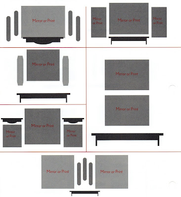
  Symmetry is the placement of even patterns. Usually the focal point is the center and other wall art such as mirrors, shelves, sconces, plates or smaller prints are placed evenly on both sides. While some smaller accessories that you use on your shelves or ledges may vary, all the major elements of the wall grouping should balance evenly. If you were to draw an imaginary line down the middle of your grouping, one side would be a mirror image of the other. In the examples I've shown above, you see perfect balance on either side.
- Let's talk about RHYTHM. Do you want a serene room or a stimulating one? Well, rhythm, the movement from one object to the next, contributes to a room's tone. Creating a certain rhythm depends on the size, shape, and spacing of objects.
- BALANCE is next. This refers to the even distribution of visual weight within your display. Maintaining balance is important because an unbalanced arrangement may look top-heavy, bottom heavy, or as if a side is falling off. Symmetrical wall design is the most straightforward illustration of balance. But you can achieve balance with asymmetrical groupings as well using techniques that pay attention to rhythm, weight and scale.
- Lastly is WEIGHT. Sometimes an object's "visual weight" demands it be displayed alone. Anything that is large, dark, bright, boldly patterned, or oddly shaped will look heavier and bigger than an item small, pale, solid, and predictably shaped.
The absolute, fool-proof method used for years is to trace framed art and wall accessories on plain brown craft paper. Cut out the shapes and tape them to your wall. Once you have achieved a grouping that is pleasing to your eye, simply measure where the hangers are positioned, mark it on your craft paper, then hammer away - right through your paper! Remove the craft paper and hang your art.
We'll take about other aspects of arranging wall art in later posts. There are so many fun and creative things we can do to make our wall express ourselves!
Tomorrow is TABLESCAPE TUESDAY and I will be sharing a table I've called "SPICE TRADE". I hope you will come back and visit with me tomorrow. Until then,
Happy Decorating!
~Alisa

2 comments:
This is great, Alisa! I will have to come back and re-read it to really take it all in.
Great timing, too, because I want to change some things up!
Melanie@Bella~Mella
Awesome post! I tend togo symmetrical...with everything...but I need to branch out...and these drawings will help (for reference)
Thanks!
Post a Comment